The Art of the Small Room: Translating Museum Spatial Intelligence Into the Urban American Apartment
The median square footage of a new apartment in Manhattan is approximately 740 square feet. In San Francisco, the figure is closer to 680. In Chicago, Boston, and Seattle, urban renters and buyers are navigating similar constraints—spaces that demand an almost architectural precision in how objects are arranged, displayed, and edited.
The design industry has generated an enormous volume of advice in response to this challenge. Storage solutions, multifunctional furniture, mirror placement, color psychology, vertical thinking—all of these strategies have merit, and most American urbanites are familiar with them. What is less commonly discussed, and what may prove more transformative, is the question not of how to fit more into a small space, but of how to make a small space feel genuinely significant.
The Raja Kelkar Museum in Pune, India, offers an instructive model for exactly this challenge—one that has nothing to do with Scandinavian minimalism or the decluttering movement, and everything to do with the sophisticated spatial intelligence that serious curatorial practice demands.
Understanding the Museum's Spatial Conditions
The Raja Kelkar Museum is housed in a traditional wada—a historic Maharashtrian mansion—whose rooms do not conform to the open-plan proportions that contemporary design culture tends to favor. The spaces are, by modern standards, intimate. Ceilings vary. Corridors are narrow. The transition between one gallery and the next is often abrupt, governed by the architecture of a building that was not designed with museum circulation in mind.
And yet visitors consistently report an experience of visual richness and spatial coherence that belies these constraints. The museum's more than 36,000 objects—spanning lamps, textiles, metalwork, weapons, musical instruments, writing implements, and domestic ritual objects—are displayed in a manner that makes each room feel complete in itself while simultaneously contributing to the cumulative impression of the whole.
How is this accomplished? The answer lies in a set of curatorial decisions that translate, with some adaptation, directly into the challenges of apartment-scale living.
Principle One: Organize by Visual Logic, Not Category
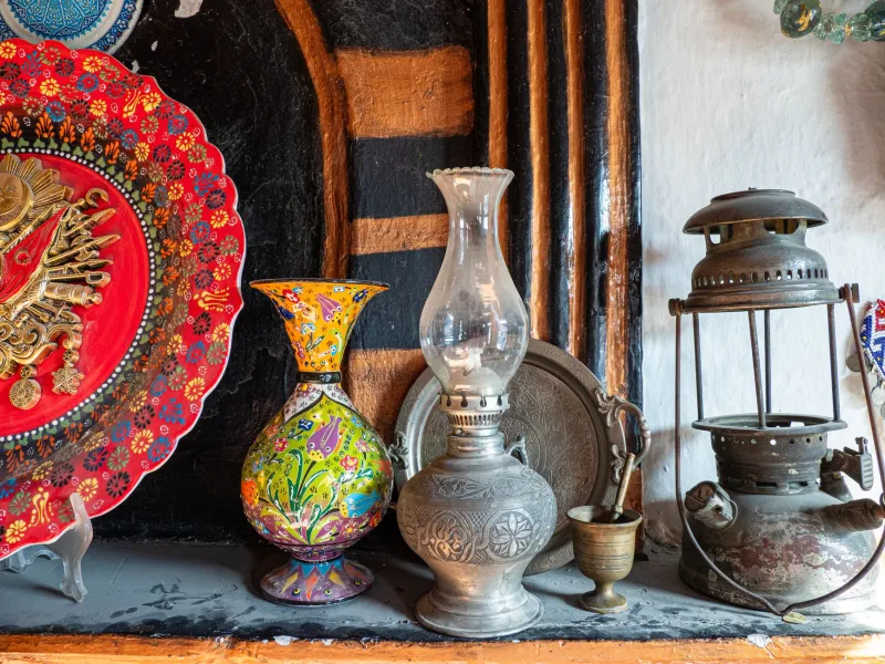
The first and perhaps most significant principle observable in the Raja Kelkar Museum's display philosophy is that objects are organized according to their visual relationships—their scale, their material texture, their color temperature, their formal character—rather than according to strict categorical taxonomy.
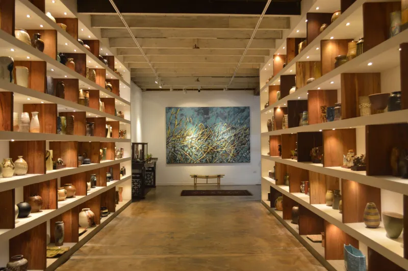
In many institutional collections, the organizing principle is typological: lamps in one room, textiles in another, metalwork elsewhere. The Kelkar collection frequently departs from this convention, grouping objects across categories when their visual properties create a compelling relationship. The result is that each gallery reads as a composed image rather than an inventory.
For the urban apartment, this principle has immediate application. The common instinct is to group objects by type—books with books, ceramics with ceramics, framed photographs together. This produces order, but it rarely produces visual interest. The alternative is to compose by visual logic: to place a ceramic vessel next to a bound book because their forms and colors create a dialogue, regardless of their categorical difference.
"The question to ask is not 'What is this?' but 'What does this look like next to that?'" advises one New York-based interior architect who has studied the museum's display methods extensively. "That shift in question changes everything about how you arrange a shelf, a mantel, or a side table."
Principle Two: Use Negative Space as an Active Element
The second principle is related to the first, and it runs counter to the instinct—common in small spaces—to fill every available surface. In the Raja Kelkar Museum, the spaces between objects are as carefully considered as the objects themselves. Empty areas within a display do not represent missed opportunities for additional placement; they represent deliberate choices that give the surrounding objects room to be seen.
This is a concept with deep roots in visual art—the painter's understanding that the canvas areas surrounding a figure are not background but active compositional elements—but it is one that interior design discourse has been slow to fully absorb.
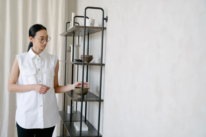
In practical terms, for a studio apartment or a one-bedroom in a dense urban market, this principle suggests a counterintuitive approach to limited shelf space: rather than filling every inch, identify which objects are strong enough to stand in isolation, and give them the negative space they require to perform that function. A single piece of Indian metalwork on a floating shelf, with nothing adjacent to it for twelve inches on either side, communicates more forcefully than the same piece surrounded by objects competing for the same visual attention.
Principle Three: Control Light to Direct Attention
The Raja Kelkar Museum's galleries demonstrate a sophisticated understanding of how light shapes the experience of objects. In rooms where natural light is limited or inconsistent, artificial lighting is deployed not merely to illuminate but to direct—to tell the visitor where to look, which object to approach first, what relationship between two pieces the curator wishes to emphasize.
For American apartments, where overhead lighting is often the default and frequently inadequate, this principle argues for a more layered approach. Task lighting, accent lighting, and ambient lighting serve distinct functions. An object worth displaying is an object worth lighting deliberately.
Lighting specialists working with small urban spaces consistently recommend a simple test: stand in a room with only natural light and identify which objects your eye moves toward first. Then introduce controlled artificial lighting and observe whether that hierarchy changes. The goal is to use light to reinforce the visual logic established through object placement—to make the room's curatorial intention legible even in the absence of daylight.
Principle Four: Create Thematic Anchors
In the museum's galleries, certain objects function as anchors—pieces of sufficient visual weight, scale, or cultural significance to organize the perception of everything around them. Other objects in the same space are displayed in relationship to these anchors: complementing, contrasting, or amplifying their effect.
In a small apartment, the anchor principle is particularly useful because it provides a decision-making framework for acquisitions and arrangements alike. Each room, or each significant display area within a room, benefits from a single object or grouping that serves as the visual and conceptual center of gravity. Everything else in that area should be evaluated in terms of its relationship to that anchor.
"When clients are struggling with a space that feels cluttered or incoherent, I almost always find that the anchor is missing or unclear," notes one Chicago-based interior designer. "Once we identify or introduce the anchor, the decisions about what to keep, what to move, and what to remove become much more straightforward."
Translating Principle Into Practice: A Room-by-Room Framework
Applying these four principles—visual logic over category, active negative space, deliberate lighting, and thematic anchors—to a typical urban apartment produces a specific set of recommendations:
The living room: Identify one object of genuine visual and personal significance to serve as the room's anchor. Display it with adequate negative space. Arrange secondary objects in visual dialogue with it, prioritizing formal and tonal relationships over categorical grouping. Introduce accent lighting focused on the anchor and its immediate neighbors.
The bedroom: Resist the instinct to display extensively in sleeping spaces. The museum principle of restraint applies with particular force here: one or two objects of genuine meaning, well-lit and well-placed, contribute more to the quality of the space than a larger accumulation of lesser significance.
The kitchen and dining area: These spaces often accommodate small-scale collections—ceramics, glassware, culinary implements—that benefit from the visual logic principle. Arrange by color temperature and formal character as well as by function.
The Raja Kelkar Museum did not set out to solve the American urban design problem. It set out to honor the objects in its care by displaying them with intelligence and intention. That those two goals turn out to be closely related is, on reflection, not surprising. The challenge of making a small space feel significant is, at its core, the same challenge that faces every curator: to make what is present feel chosen, and to make what is chosen feel necessary.